From the Ground Up: Renewed Menus for Mälarpaviljongen's Milestone
CLIENT
Mälarpaviljongen
LOCALITY
Stockholm, Sweden
DATE
April 2024
CATEGORY
Branding
TYPE
Graphic Design, Graphics, Branding
MEDIUM
Digital + Print
STATUS
Completed
In celebrating its two-decade milestone, Mälarpaviljongen undertook a comprehensive menu revitalization, aligning with its commitment to bringing people together and creating an exceptional waterfront experience. Inspired by the venue's distinctive locale, the menus feature a harmonious blend of typographies and colors, while iconic symbols pay homage to its verdant surroundings. Looking ahead, the integration of supporting motifs promises to fortify brand identity across various graphics, fostering a cohesive and immersive dining experience for guests throughout the 2024 season and beyond.
A restaurant's menu often serves as the initial point of contact for new patrons, making it crucial to offer an experience that is intuitive, well-organized, and visually appealing. As Mälarpaviljongen commemorates two decades of welcoming guests to its lush urban waterfront oasis, they embarked on a journey to completely revitalize their menus, both in print and online. This transformative process began with our collaboration on the restaurant's branding guidelines, where we crafted their distinctive marks, logos, typography, colors, and complementary symbols. Armed with these foundational elements, assembling the refreshed designs showcased below became a seamless endeavor.
DETAILS IN DESIGN
In developing this menu, we took inspiration from the restaurant's fresh branding guidelines, utilizing the designated typologies. Despite the challenge of incorporating a substantial amount of text to cater to both Swedish and English readers, we successfully maintained a sleek and uncluttered look by implementing two colors on each menu. To enhance the overall design, we delicately added a subtle shadow beneath the text, staying true to the brand's desired typewriter aesthetic in its visual elements.
We paid attention to detail by incorporating the iconic Mälarpaviljongen "water line" on the menu dividers, a distinctive branding feature that imbues uniqueness. For emphasis and visual contrast, we introduced Telemagenta (#CC3366) colored text alongside the darker shades. This color choice extended to additional text, like "Always Welcome," which celebrates the establishment's dog-friendly policy, and information about allergies. By embracing these design elements, we aimed to create a visually appealing menu that aligns seamlessly with the restaurant's brand identity.
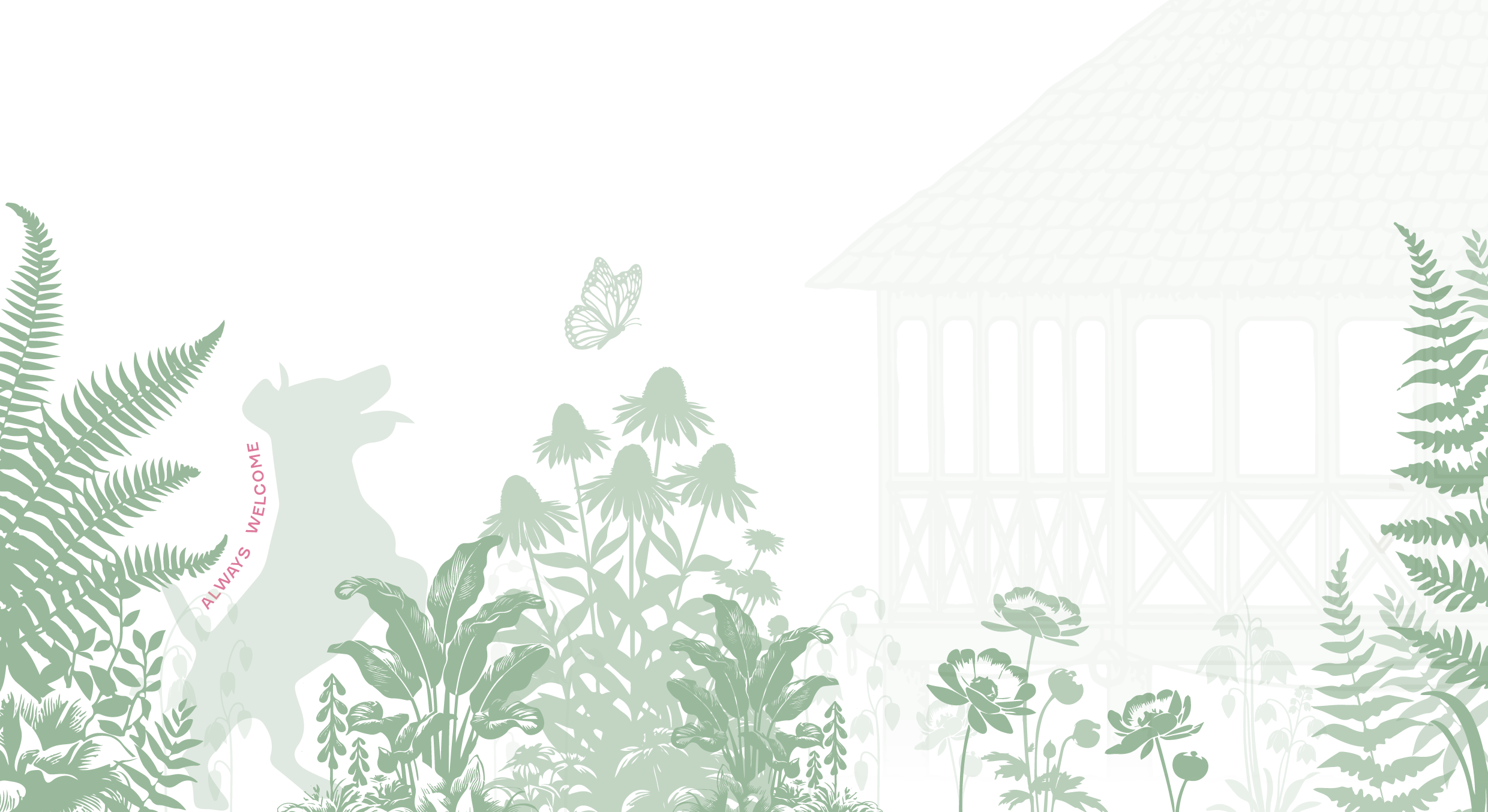
Additionally, we leveraged the supporting symbols to craft a picturesque landscape adorning the bottom of each menu, serving as a grounding element that pays homage to their distinct locale, verdant gardens, and the natural surroundings enveloping guests onsite. These symbolic motifs will extend their presence throughout the season across various graphics, fortifying their cohesive brand identity and enhancing overall visual continuity.
DRINK & DINNER
The restaurant has two main menus onsite which include the dinner menu with the wine list and the drink menu. The colors not only adhere to the branding guidelines but also complement the exterior trim of the menu protectors in which each menu is encased. This differentiation not only assists guests and staff in distinguishing between menus but also enhances the guest experience by introducing a subtle detail, rather than using plain black text. Below you may view the two main menus that will be used for the 2024 season.
LUNCH
Beginning this year, the restaurant will feature a daily lunch and weekly vegetarian option. To help promote lunch and this new addition to Mälar’s offerings we needed to create an easy-to-use and adaptable menu.
Utilizing a consistent design methodology, the new lunch menu has been crafted to offer a seamless and enjoyable dining experience for their guests. In addition to the enduring favorites, a weekly rotating lunch menu, following the same format, will be introduced every Monday.
This new menu is thoughtfully downsized to fit on card stock, allowing for two menus per page, printed double-sided for easy access at the registers where orders are placed. The smaller size not only enhances convenience but also hints at the potential for a more mobile-friendly approach to their larger menus (dinner and drink) in the future, building on the success of this innovative design adaptation. This strategic adjustment aims to optimize the dining journey, blending practicality with a touch of modernity to elevate the overall customer experience.
WHAT IS NEXT?
Moving forward, the menu has been thoughtfully designed for seamless adaptation by all staff members. Additionally, an "avec" menu will soon be introduced to enhance guest convenience further. The project is shaping up to provide not only a dynamic dining experience but also efficiency and enhanced customer satisfaction.


