Shaping Identity – Art & the Heart
CLIENT
Art & the Heart
LOCALITY
Saint Paul, Minnesota
DATE
July 2025
CATEGORY
Branding
TYPE
Graphic Design, Graphics, Logo, Branding
PACKAGES
Professional Branding - K Logo Design - M
Branding Guide - M
MEDIUM
Digital
STATUS
Completed
ZFMK Creative partnered with Art & the Heart to develop a brand identity rooted in healing, creativity, and connection. The project included a custom logo system, color palette, supporting graphics, and a comprehensive branding guide. Everything was designed to reflect the organization’s mission of making emotional well-being accessible through art.
Project Overview
Art & the Heart is a community-centered nonprofit out of Saint Paul, Minnesota that blends art education with principles of positive psychology to support emotional growth, self-expression, and confidence in children and young adults. As the organization continued to grow, there was a need for a visual identity that felt as thoughtful and intentional as the work itself. The founder was looking for something that could communicate care, warmth, and credibility across both digital and in-person experiences.
This project focused on creating a cohesive brand system that could be consistently applied across the website, printed materials, class resources, and outreach, while remaining gentle, human, and approachable.
Founder Emma M. Darst brought a clear vision to the project for what the brand should feel like, even if it was difficult to articulate visually. She was looking for a logo that could hold both strength and softness—something expressive but not overwhelming, professional yet deeply human.
Key goals included:
A symbol that reflected healing, growth, and creativity
A mark that felt welcoming to children while still resonating with parents and educators
A flexible identity system that could grow with the organization
A visual language rooted in compassion, not clinical therapy
The resulting identity was designed to feel safe, warm, and emotionally grounded—mirroring the experience Art & the Heart aims to create in every class.
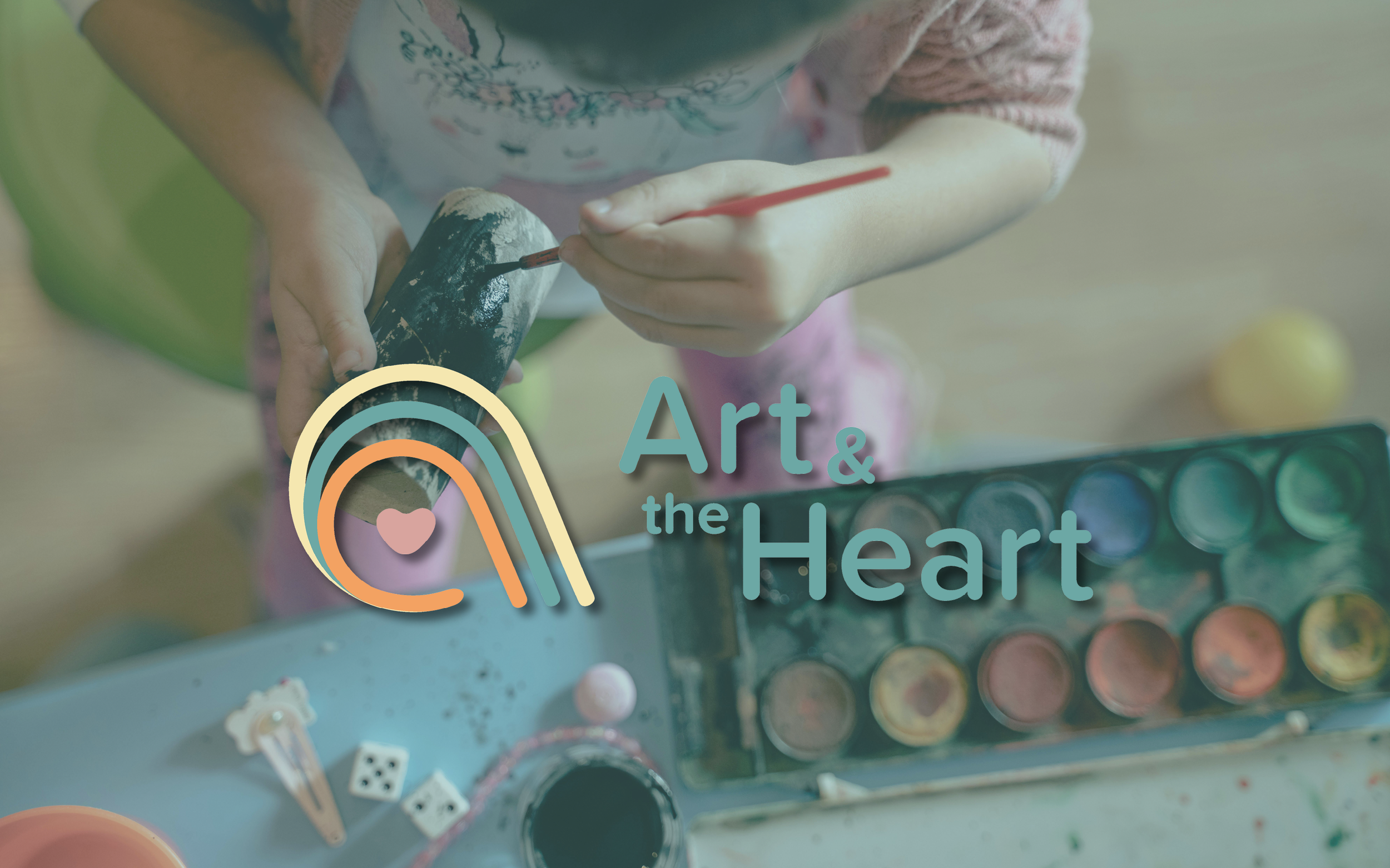
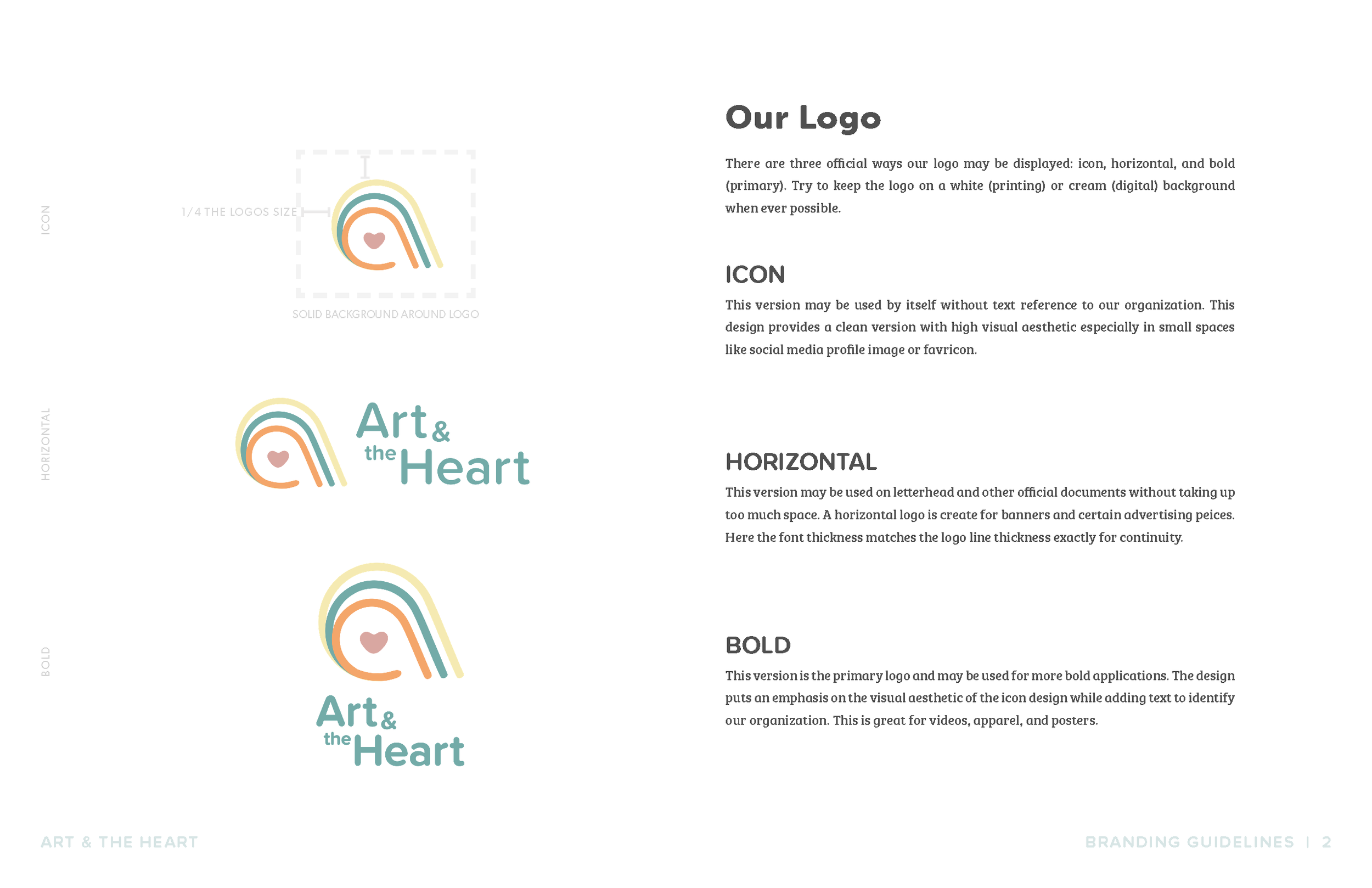
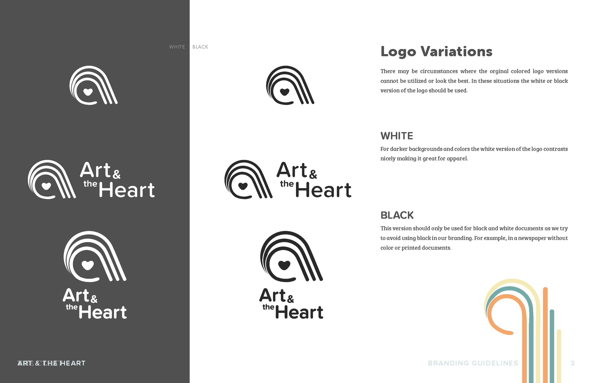
LOGO DESIGN & Versions
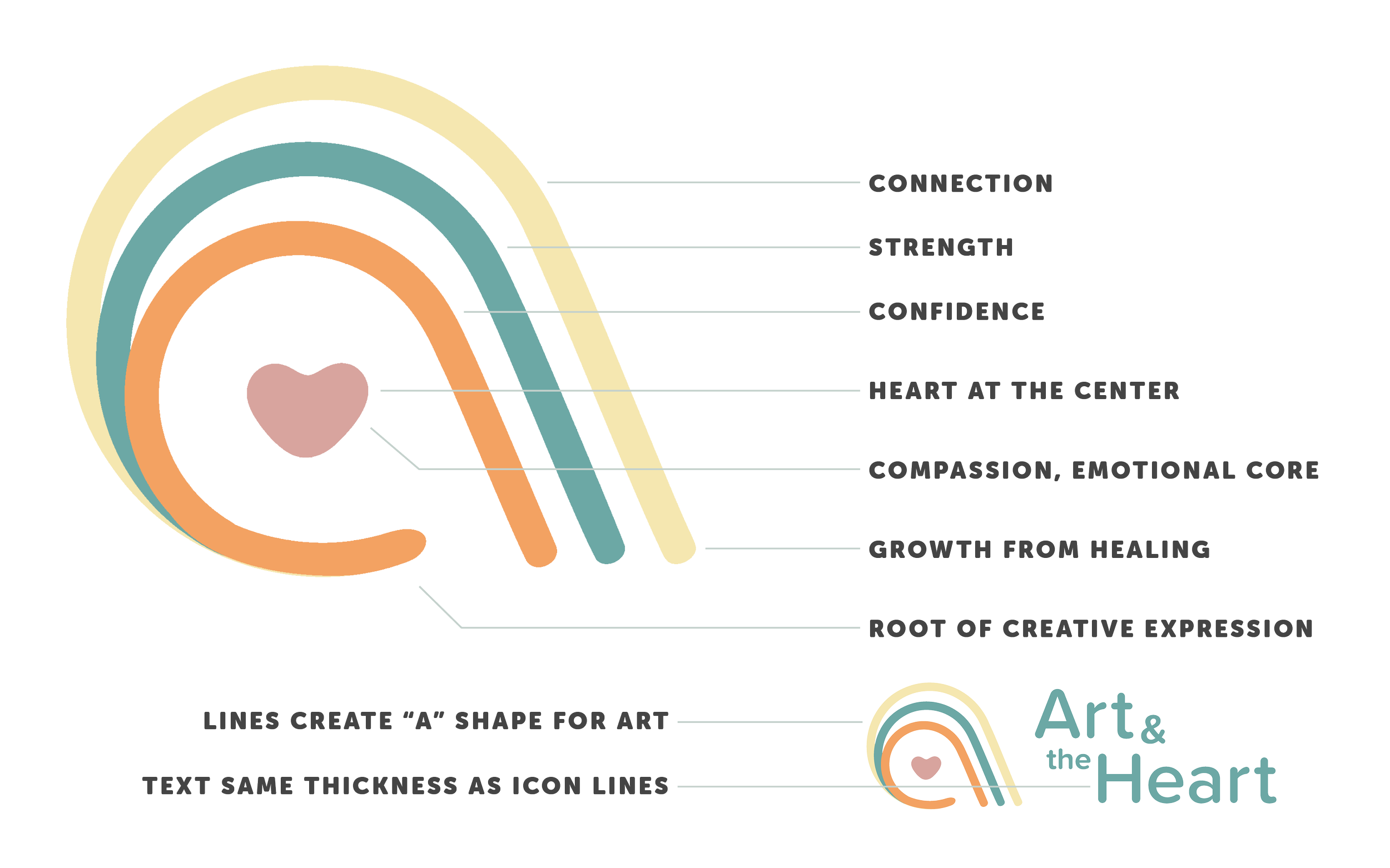
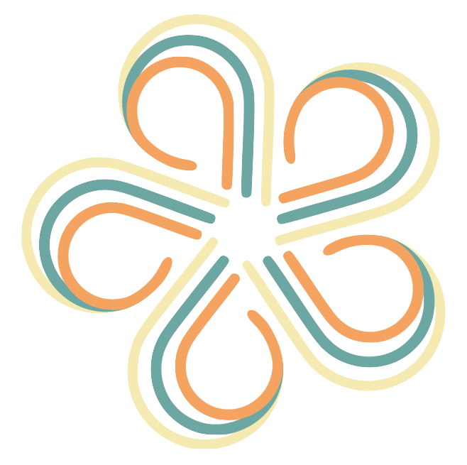
At the center of the identity is a custom icon built from layered, flowing lines that form an abstract heart and an implied “A” shape—representing both Art and the Heart. The layered arcs symbolize connection, strength, and confidence, while the heart at the center reflects compassion and emotional grounding.
The lines intentionally grow outward, reinforcing the idea of healing as a process—one that begins internally and expands through creative expression. The consistent line weight between icon and typography creates visual harmony and reinforces the sense of balance throughout the system.
The icon was designed to stand alone or work seamlessly with the logotype, allowing for flexibility across platforms and formats. As part of the brand positioning work, ZFMK Creative developed the tagline the heart of healing, capturing the organization’s ability to heal the heart through art.

ICON
The icon logo is a standalone mark. It is designed for use in small or compact spaces where simplicity and instant recognition are essential.
This version works particularly well for social media avatars, profile images, highlights, stickers, and secondary branding moments. By stripping the logo down to its most recognizable element, the icon reinforces brand familiarity without relying on text.
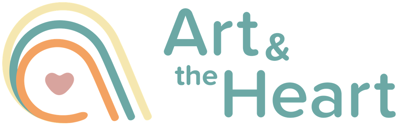
RIBBON (Horizontal)
The ribbon, or horizontal, logo is a streamlined alternative to the primary mark. Its horizontal orientation allows it to fit naturally into layouts with limited vertical space, such as letterhead, website headers, and official documents.
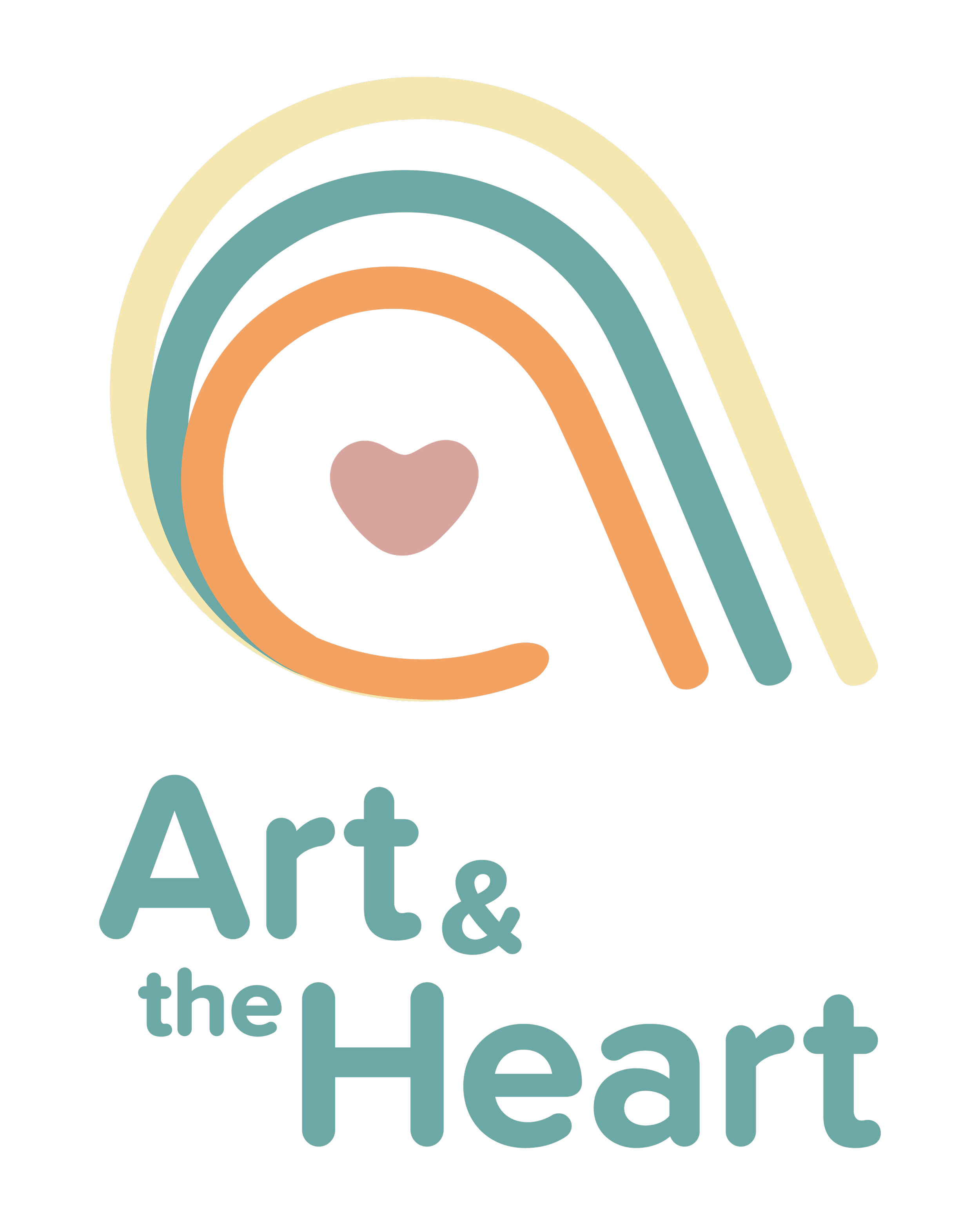
BOLD (Primary)
The bold logo version is the primary mark representing the organization and may be used for more bold applications. The design emphasizes the icon's visual aesthetic while adding text to identify the organization.
This is great for videos, apparel, and posters.
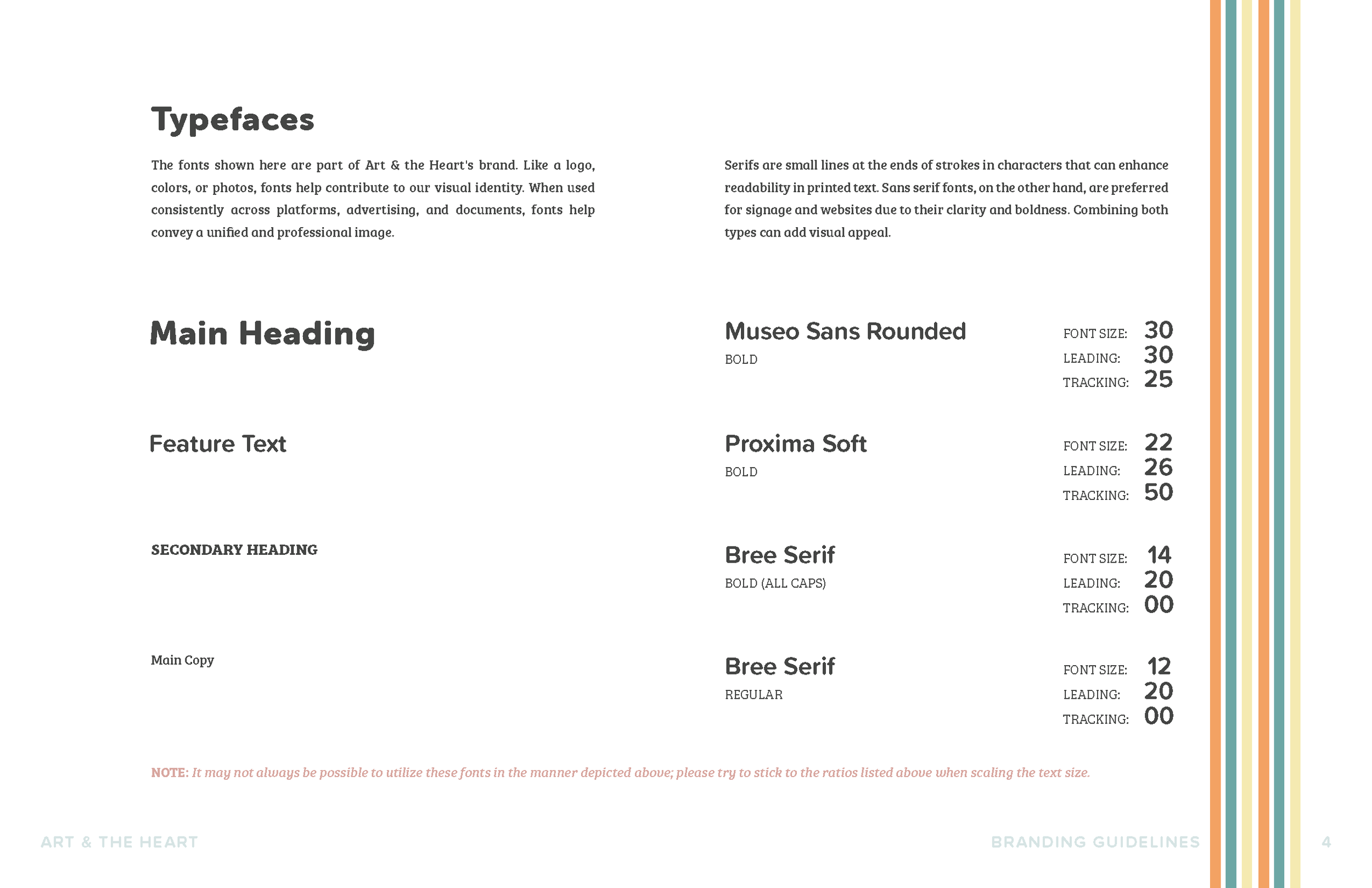
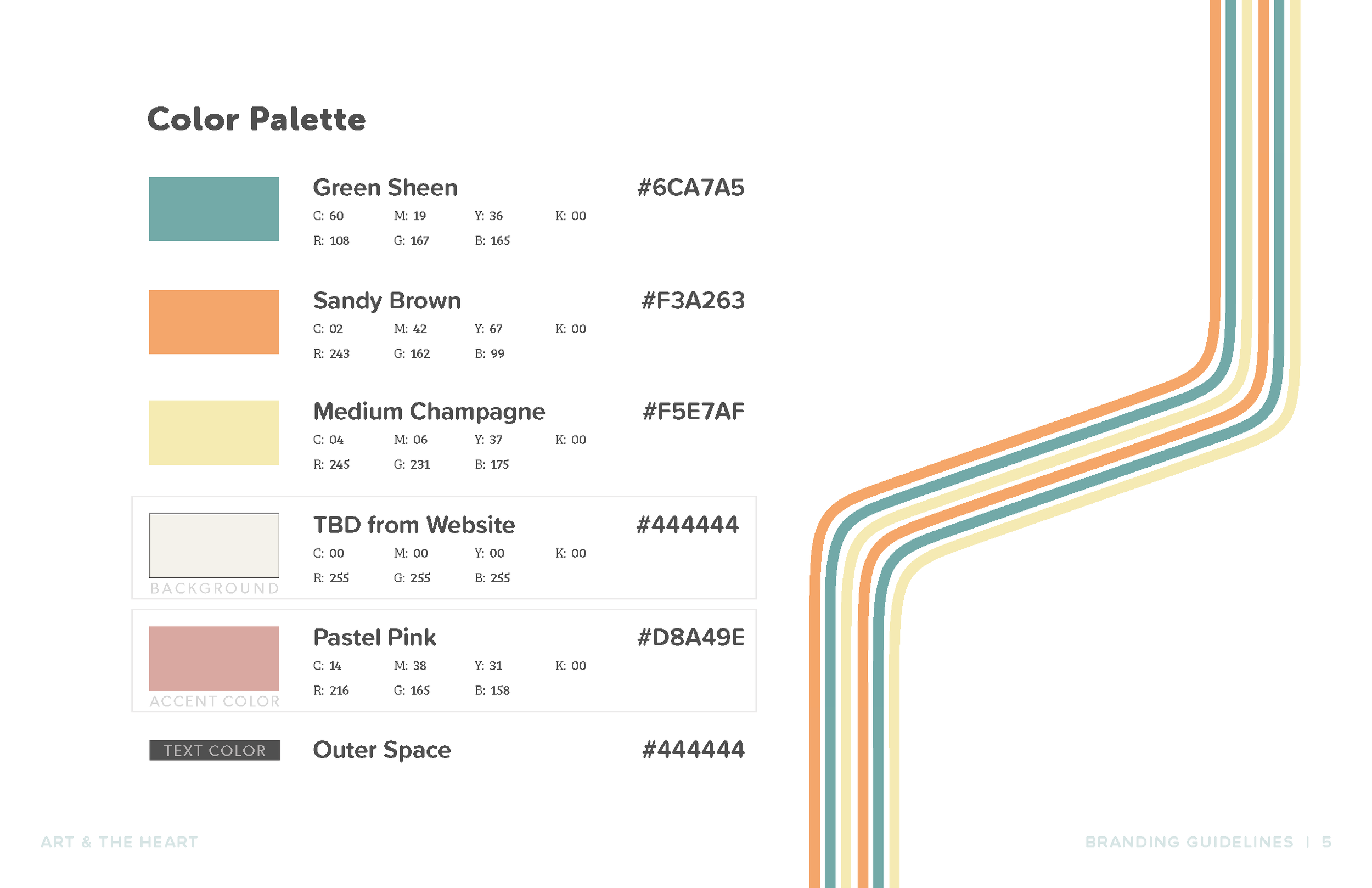
COLOR PALETTE
The Art & the Heart color palette was developed to support warmth, clarity, and emotional approachability while remaining practical for everyday use across digital, print, and educational materials. To ensure consistency, each color was assigned a defined role within the brand system and documented with specific color values.
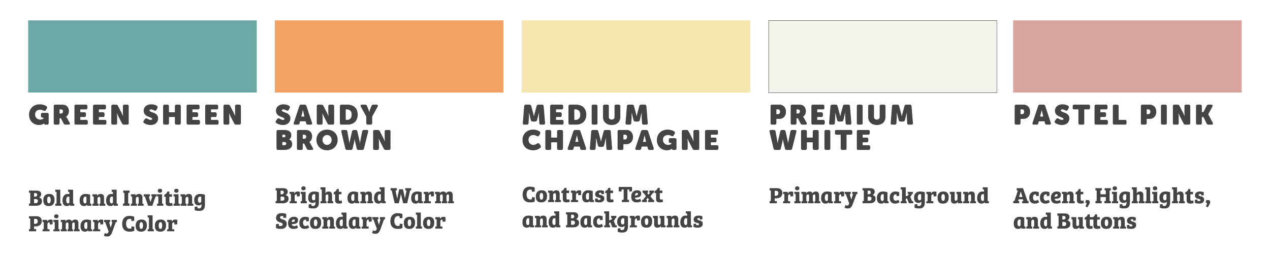
Green Sheen (#6CA7A5) serves as the primary brand color. Bold yet calming, it anchors the identity and appears across key brand moments, reinforcing themes of growth, balance, and connection. Sandy Brown (#F3A263) is a bright, warm secondary color. It introduces energy and optimism into the palette and is used to support expressive moments, creative highlights, and visual emphasis without overpowering the system.
Medium Champagne (#F5E7AF) is used as a soft contrast color for text and backgrounds. Its subtle warmth supports readability while avoiding stark contrast, making it well-suited for learning environments and reflective content. Premium White (#F9F9F6) is the primary background color across the brand. It provides visual breathing room and allows supporting colors and graphics to stand out, keeping layouts light, open, and accessible.
Pastel Pink (#D8A49E) is used selectively as an accent color for highlights, buttons, and moments of emphasis. This tone reinforces compassion and emotional care, aligning closely with the organization’s mission.
Together, the palette creates a balanced system that feels intentional, calming, and adaptable—designed to support Art & the Heart’s work across platforms, audiences, and spaces.
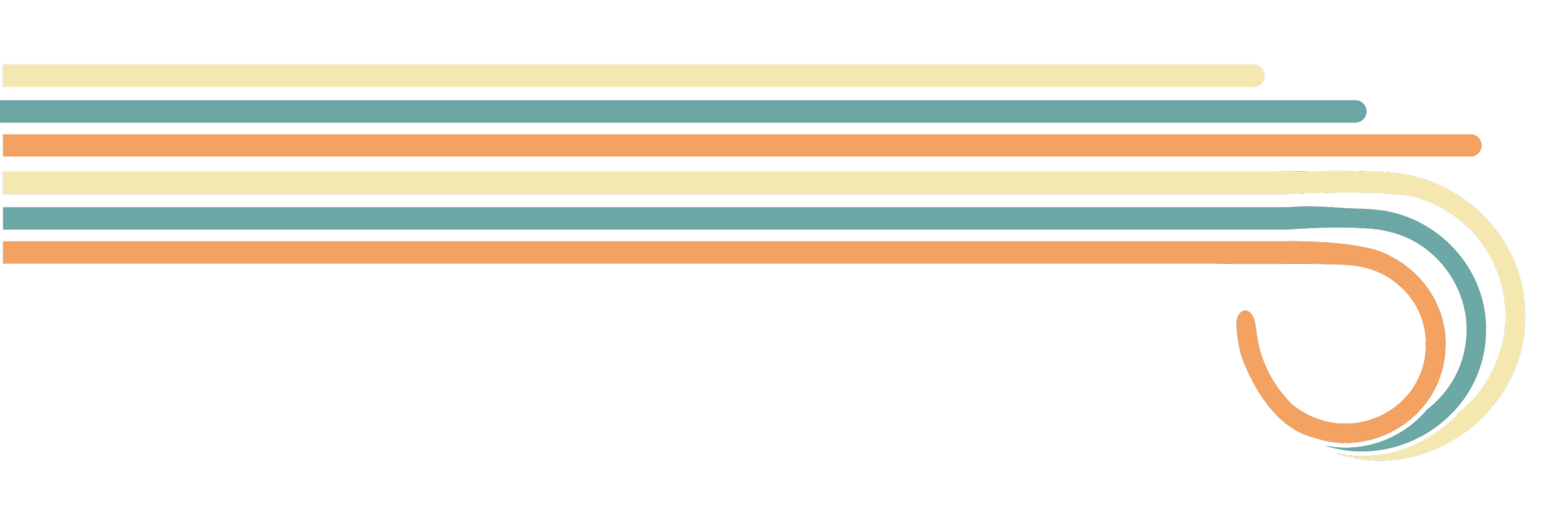
SUPPORTING Graphics
Supporting graphics extend the identity beyond the logo and provide visual rhythm across layouts. Repeating line motifs derived from the icon are used as dividers, borders, and framing elements—reinforcing continuity without overwhelming content.
These elements allow the brand to scale visually across worksheets, presentations, signage, and the website, while maintaining a consistent, recognizable look.
BRINGING it all together
To ensure the brand could be used confidently and consistently, all assets were documented in a comprehensive branding guide. The guide outlines logo usage, color application, typography, and supporting graphics, providing clear direction for both internal use and future collaborators.
By translating values into a usable system, the Art & the Heart brand is now equipped to grow while staying rooted in its mission—creating spaces where creativity, healing, and connection can thrive.
the heart of healing
This branding system also informed the planning and design of Art & the Heart’s new website, created by ZFMK Creative. By carrying the palette, typefaces, and hierarchy directly into the digital experience, the site reinforces the brand’s warmth, playfulness, and accessibility across every page.