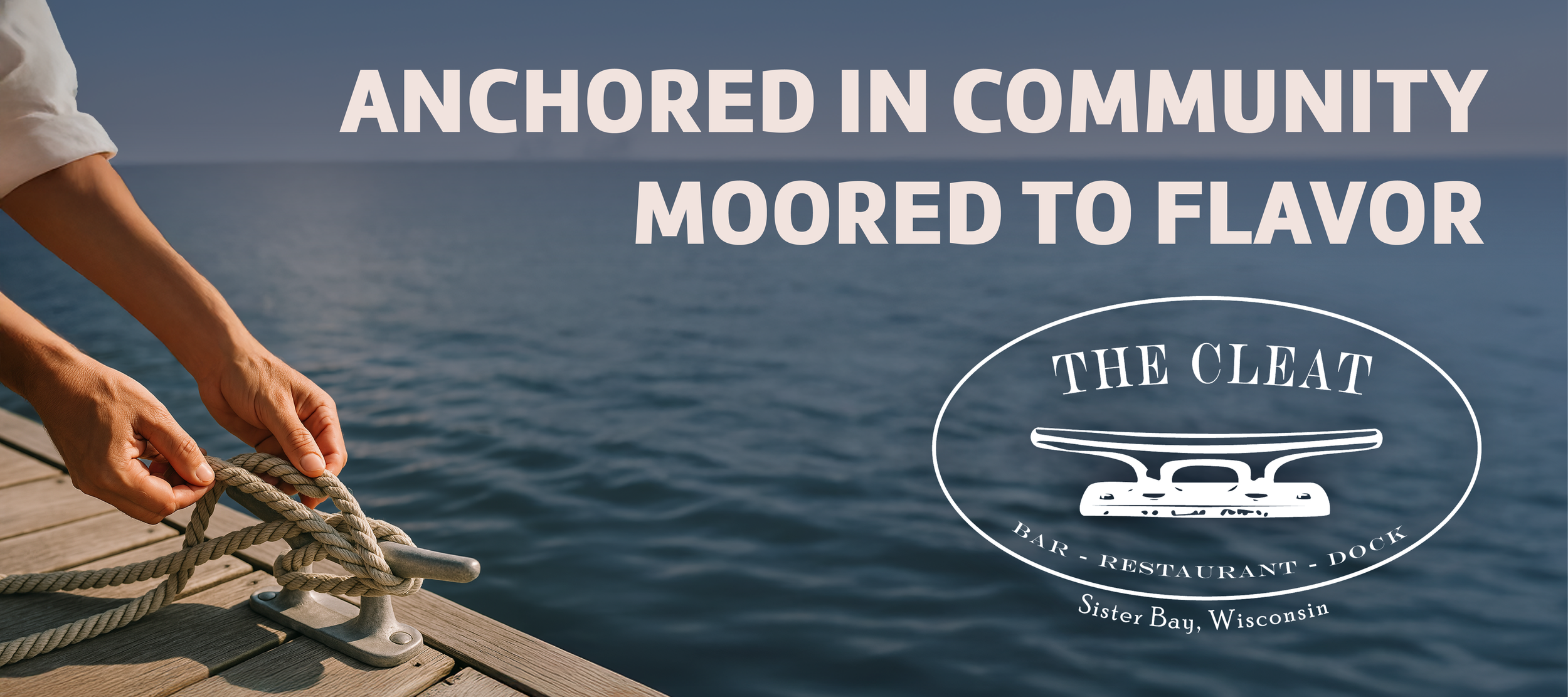
Anchored Identity – The Cleat Branding
CLIENT
The Cleat
LOCALITY
Sister Bay, Wisconsin
DATE
April 2025
CATEGORY
Branding
TYPE
Graphic Design, Graphics, Logo, Branding
PACKAGES
Professional Branding - K, Logo Design - Y, Branding Guide - Y, & Graphic Design - Y
MEDIUM
Digital
STATUS
Completed
As The Cleat prepared to open and introduce itself to the Sister Bay and Door community, we led a comprehensive branding refresh focused on flexibility, clarity, and long-term usability. By evolving the existing logo into a scalable system and pairing it with a defined color palette and content framework, the brand was positioned to show up consistently across every guest touchpoint.
ORIGINAL DESIGN + IMPROVEMENT Areas
The Cleat entered the branding process with an established logo that had strong local recognition and historical ties to the site. The mark centered on a cleat illustration framed within an oval, paired with the restaurant name and location. While the logo was familiar and meaningful, it served primarily as a static asset rather than a flexible brand system.
The original logo was provided as raster image files rather than vector artwork, which limited its scalability and made it difficult to apply across large-format signage, apparel, and print production without loss of quality. Its reliance on a narrow color range—primarily navy and black—further constrained its usability, particularly on darker backgrounds or in layered compositions where contrast and hierarchy were needed.
In addition, the logo existed as a single configuration with no alternate layouts or supporting variations. This made it challenging to adapt the mark across different contexts, such as digital platforms, social media, packaging, and environmental applications. Beyond the logo itself, there were no established brand colors, typography guidelines, or supporting graphic elements to help extend the identity consistently across touchpoints.
These limitations highlighted the need for a refreshed approach—one that preserved the recognizable character of the original logo while improving clarity, flexibility, and long-term usability across the full range of applications The Cleat requires.
REFRESHED LOGO DESIGN & COLOR PALETTE
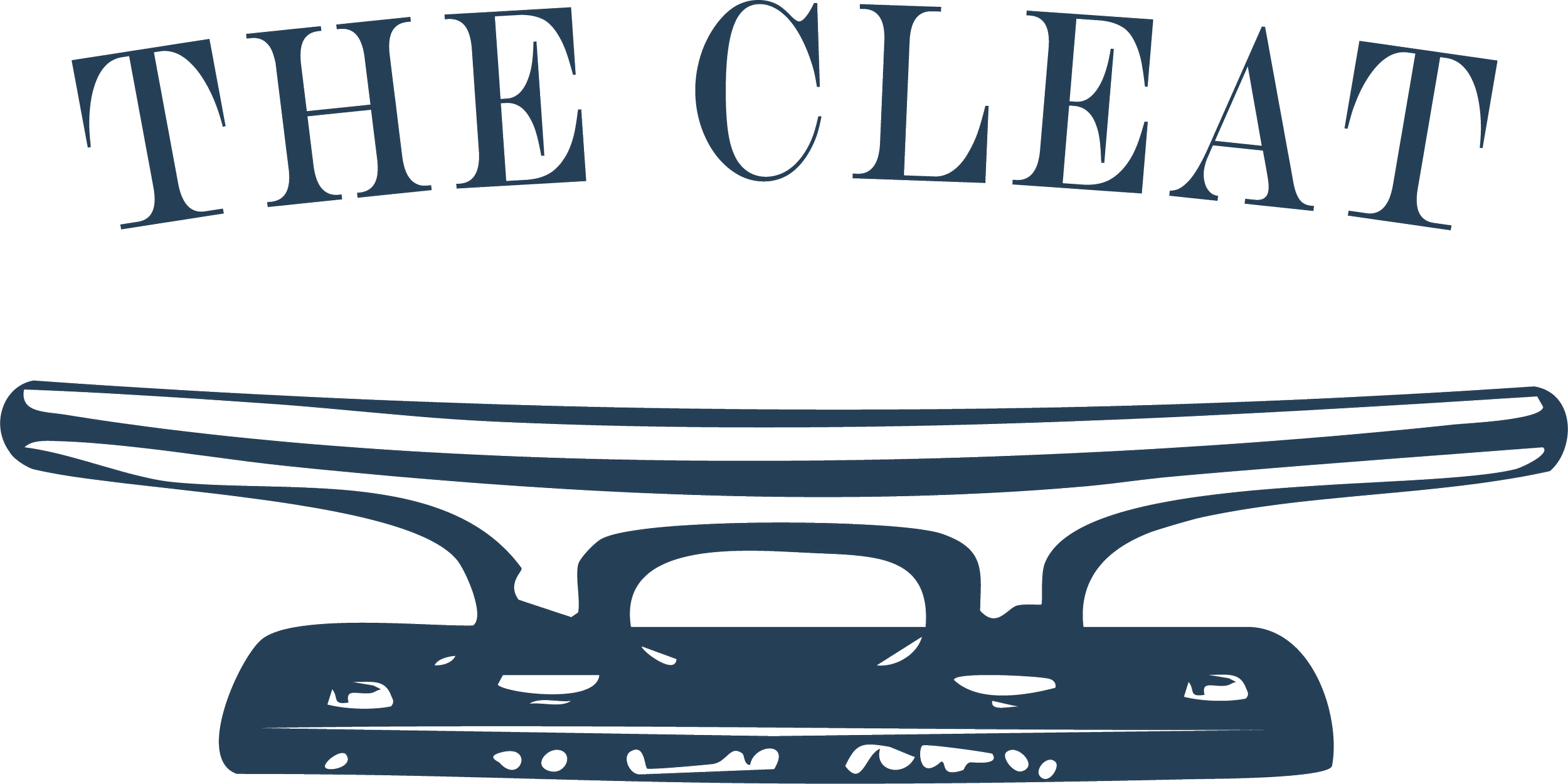
Building on the original mark, we rebuilt The Cleat’s logo as a fully vector-based system designed for flexibility, clarity, and long-term use. The updated logo preserves the recognizable cleat illustration while correcting alignment issues and improving visual stability across applications.
We introduced multiple logo configurations to support different contexts, including a primary oval mark with a white field for maximum legibility and a simplified outlined version for use on varied backgrounds and materials. These variations allow the logo to scale cleanly from small digital placements to large-format signage and apparel without loss of detail or consistency. As part of the brand positioning work, ZFMK Creative developed the tagline Anchored in Community, Moored to Flavor, capturing The Cleat’s role as both a neighborhood gathering place and a dockside destination.

By expanding the logo system and aligning it with a newly defined color palette (below), the refreshed mark retains its original character while gaining the adaptability needed for everyday operations, seasonal promotions, and long-term brand growth.
While The Cleat had an existing affinity for navy blue, it was being applied inconsistently across materials. As part of the branding guide, we standardized a single primary navy tone and built a supporting color system around it to create clarity, cohesion, and flexibility across all touchpoints.
The resulting palette balances familiarity with refinement. It reflects the restaurant’s waterfront setting, maritime heritage, and warm, community-driven atmosphere—while remaining practical for daily use by staff, vendors, and partners.
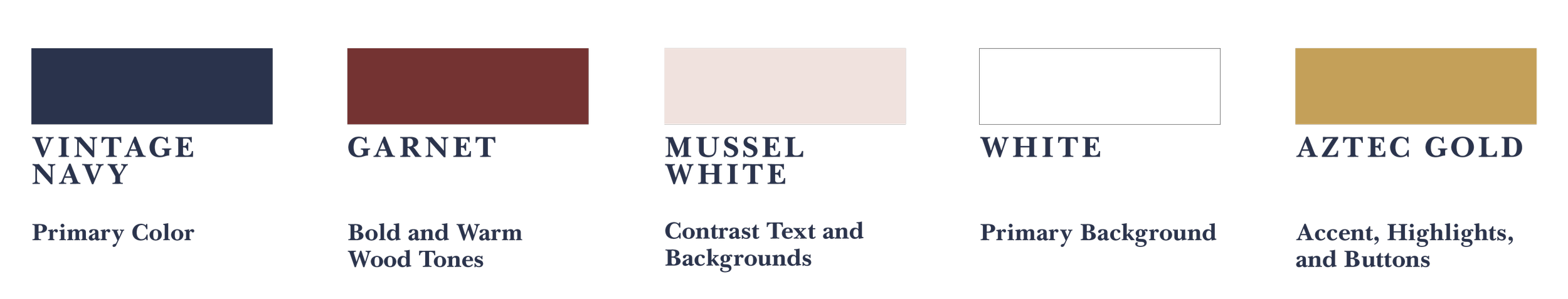
Vintage Navy (#2A344D) was established as the primary brand color, anchoring the visual identity and providing a consistent foundation across print, digital, apparel, and signage. From there, we introduced a set of complementary colors to support contrast, hierarchy, and mood without overwhelming the brand.
Clean White (#FFFFFF) and Mussel White (#F0E2DE) form the base of the system, ensuring legibility and warmth across menus, websites, and interiors. Aztec Gold (#C5A059) was introduced as a controlled accent—used sparingly to highlight calls to action, details, and moments of emphasis. Garnet (#743332) adds depth and richness, supporting atmospheric applications such as packaging details, menu borders, and select interior elements.
Beyond defining the palette, we documented how each color should be used in practice—from uniforms and take-away packaging to signage, tableware, and everyday guest-facing materials. This ensured the colors were not just visually cohesive, but operationally useful—supporting consistency across seasons, platforms, and physical spaces.
The result is a color system that feels intentional, adaptable, and distinctly The Cleat.
ICON
The icon logo is a standalone mark built around the cleat illustration. It is designed for use in small or compact spaces where simplicity and instant recognition are essential.
This version works particularly well for social media avatars, profile images, highlights, stickers, and secondary branding moments. By stripping the logo down to its most recognizable element, the icon reinforces brand familiarity without relying on text.

RIBBON (HORIZONTAL)
The ribbon, or horizontal, logo is a streamlined alternative to the primary mark. Its horizontal orientation allows it to fit naturally into layouts with limited vertical space, such as letterhead, menus, website headers, and official documents.
This version may be used with or without the cleat icon, depending on scale and context. When the icon becomes too small to read clearly, the wordmark alone maintains brand recognition while keeping the layout clean and balanced.

BOLD (Primary)
The icon logo is a standalone mark built around the cleat illustration. It is designed for use in small or compact spaces where simplicity and instant recognition are essential.
This version works particularly well for social media avatars, profile images, highlights, stickers, and secondary branding moments. By stripping the logo down to its most recognizable element, the icon reinforces brand familiarity without relying on text.
This version of the logo was not created by ZFMK Creative and was instead adapted from the orignial designer to match the new standards created in the new branding guidelines.
SUPPORTING SYMBOLS
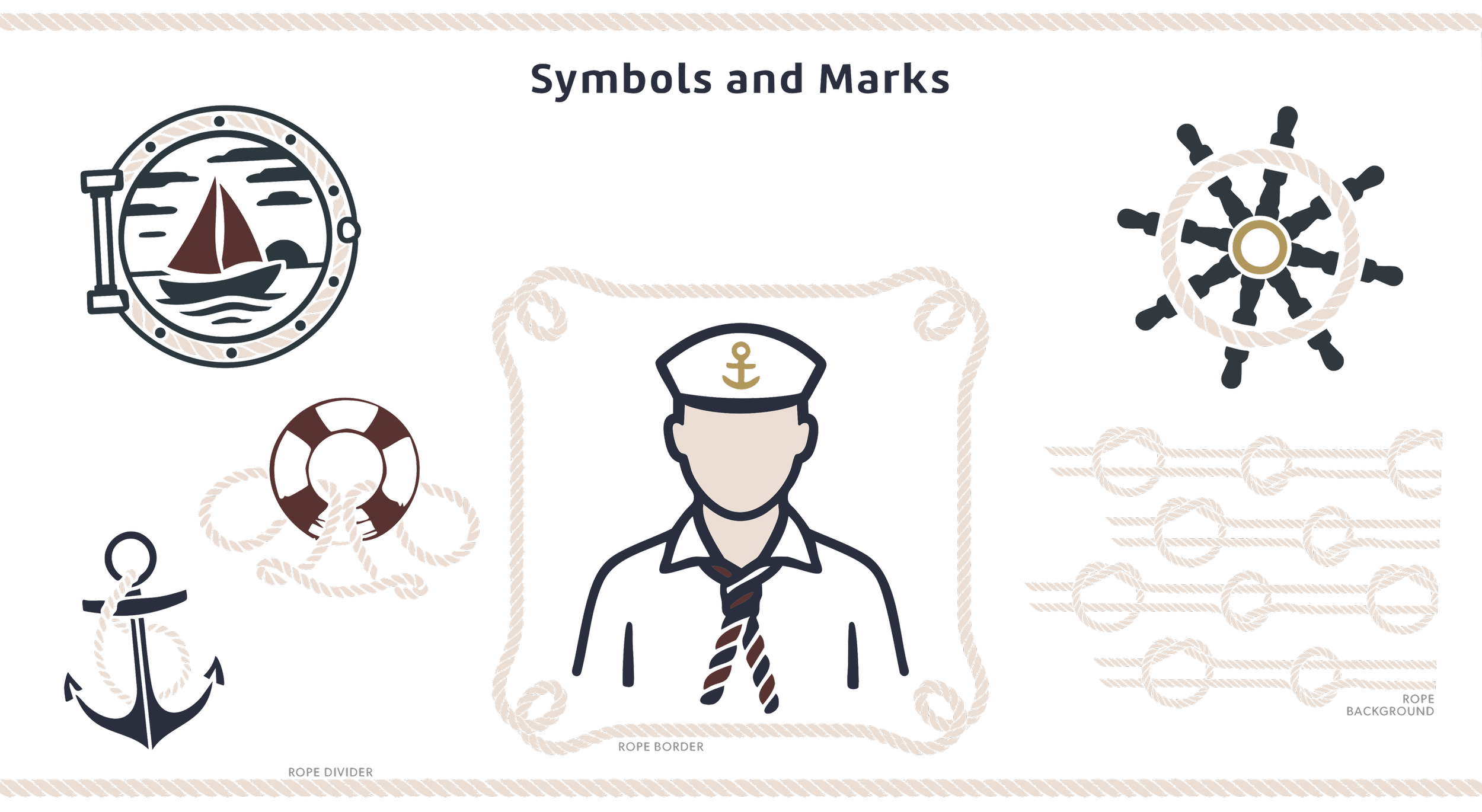
To extend The Cleat’s visual system beyond its primary logo and content-stream icons (shown next), we developed a set of supporting symbols that are both functional and playful. These marks reinforce the brand's nautical identity while providing flexible graphic elements for menus, signage, social content, and print materials.

The symbol set includes maritime-inspired elements such as rope dividers, anchors, ship wheels, portholes, and crew illustrations. Together, they create visual continuity throughout the brand while allowing space for variation and lighter moments within the overall system. These symbols were intentionally designed to serve as filler content—helping layouts feel complete without relying on photography or unbranded graphics. Several of the illustrations were also created with younger guests in mind, with an outlined version making them suitable for kids’ menus or coloring sheets while remaining cohesive with the broader brand identity.
By keeping the symbols simple, recognizable, and adaptable, the system supports both practical needs and guest experience while adding character without overwhelming the core brand.
Content + Content Streams
To support The Cleat’s day-to-day marketing needs and long-term brand consistency, we developed a clear social media content framework built around five distinct content streams. Each stream reflects a core part of the guest experience while giving the team a practical system for planning, posting, and maintaining a cohesive visual identity across platforms.
By defining these content streams early, we helped The Cleat move away from ad-hoc posting and toward a more intentional, recognizable presence—one that balances food, drinks, place, people, and story. Each stream was paired with a dedicated color from the brand palette and supported by iconography to make content planning intuitive and repeatable.
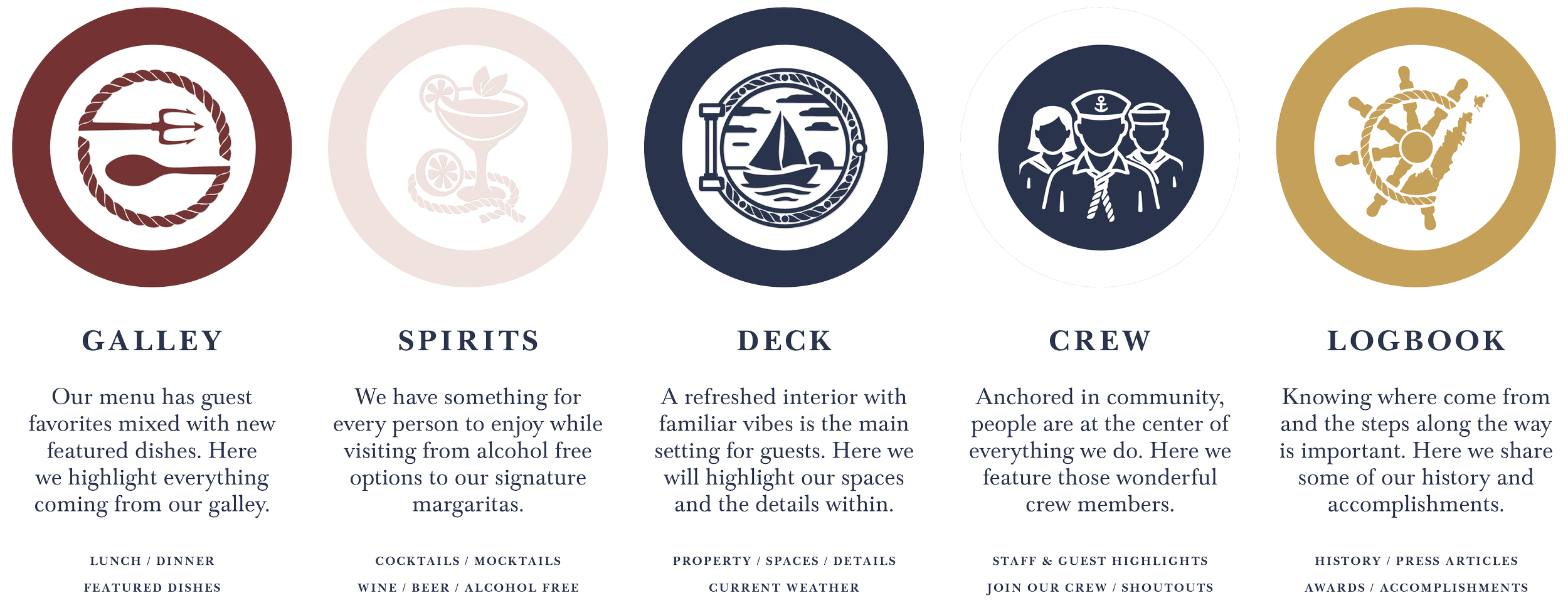
Galley
The Galley stream focuses on food. This includes lunch and dinner service, featured dishes, seasonal specials, and guest favorites. Content in this stream highlights what is coming out of the kitchen and what keeps people coming back.
Spirits
Spirits captures The Cleat’s beverage program, from signature cocktails and margaritas to beer, wine, and alcohol-free options. This stream allows flexibility to showcase new drinks, classics, and inclusive offerings for every guest.
Deck
Deck is centered on place. This stream highlights the refreshed interior, outdoor spaces, weather updates, and the small details that define the atmosphere. It reinforces The Cleat as a destination, not just a restaurant.
Crew
Crew puts people at the center of the brand. This stream features staff spotlights, behind-the-scenes moments, guest shoutouts, and hiring posts. It reinforces The Cleat’s role as a community-driven business and employer.
Logbook
Logbook is where history and progress are documented. This stream includes milestones, press mentions, awards, announcements, and reflections on where The Cleat has been and where it is headed.
In addition to defining the five content streams, we developed a practical strategy guide to help The Cleat use this system effectively throughout the year. The focus was not on rigid scheduling but on flexibility, allowing the team to adapt content based on seasonality, staffing, weather, and business priorities.
Rather than assigning content streams to fixed days of the week, we recommended a rotational approach that balances variety over time. This ensures that no single stream dominates the feed while still allowing room for spontaneous, real-time content when it matters most. The framework also outlines when certain streams naturally take priority. The Cleat could highlight Deck content during peak summer months and use Logbook content to maintain momentum during quieter periods.
This strategy was designed to support The Cleat as a small, seasonal business by reducing decision fatigue and providing clear guidance on what to post and when, without adding unnecessary complexity. To support implementation, we created a set of foundational, framed templates for use in Adobe Express. These templates were intentionally simple, serving as a starting point rather than a rigid system, allowing the team to adopt them when and if they fit their workflow.
The overall strategy was built to grow with the business, providing structure where needed while remaining flexible enough to evolve as The Cleat’s team, tools, and capacity change over time.
BRINGING it all together
With the full brand system in place, the final step was to consolidate all assets, rules, and applications into a clear, accessible branding guide. This document was designed to support consistent use of the brand across day-to-day operations—whether content is created by staff, external partners, or future collaborators.
The guide brings together logo variations, color usage, typography, supporting symbols, and content standards in one reference point. Rather than prescribing rigid rules, it provides clarity and flexibility—allowing the brand to be applied confidently across digital platforms, print materials, signage, packaging, and on-site touchpoints.


While this project focused on building a strong foundation rather than measuring short-term performance, early indicators suggest the system is resonating. Several of the stories created to support Instagram highlights remain among the most-viewed content on The Cleat’s account over the past six months, reinforcing the value of a cohesive visual language paired with intentional storytelling.
By grounding the brand in a clear system and documenting how it should be used, the branding guide positions The Cleat for consistency, adaptability, and long-term growth—ensuring the identity can evolve while remaining recognizable and rooted in place.